Client • EW Hotel Collection
Sector – Hospitality
—
Project Summary
EW Hotel Collection partnered with me to define a clear and distinctive brand identity that reflects its vision for modern, design-led hospitality experience while unifying its growing portfolio. The aim was to create a visual language that embodies understated luxury, architectural precision, and quiet confidence. We developed a cohesive identity built around refined typography, a confident monogram, and a restrained colour palette. The result is a brand that feels timeless, elevated, and effortlessly sophisticated.
Deliverables
Brand Identity
Wordmark and Logotype
Icon Design
Colour Palette
Website Refinement
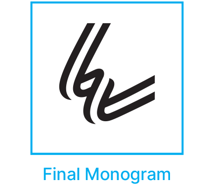
The Identity
Hero Horizontal
Hero Centered
Center Stacked
Horizontal Stacked
White on Colour
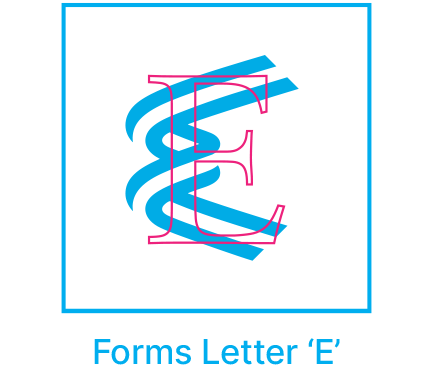
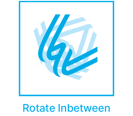
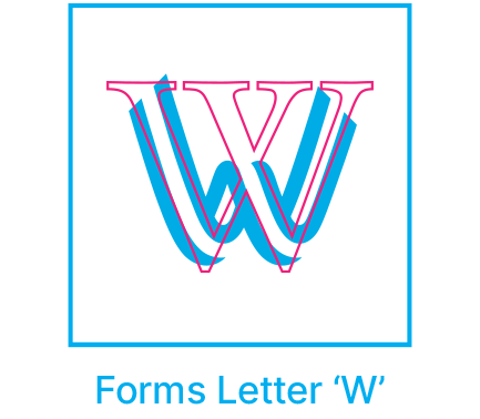
The ‘EW’ Icon
Logotype Clear Space
Behind the Design - The Thread


Colour Palette

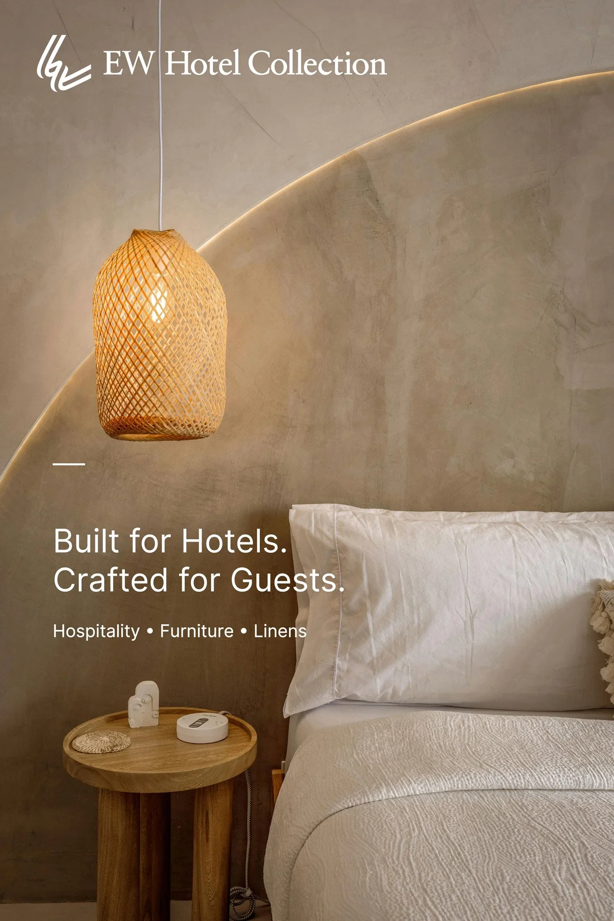
Built for Hotels. Crafted for Guests.
Website


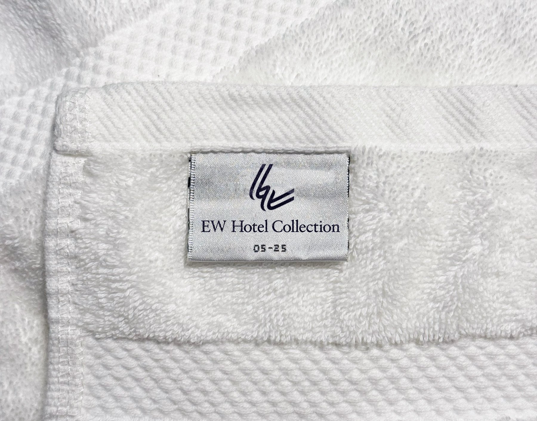
Towel Label
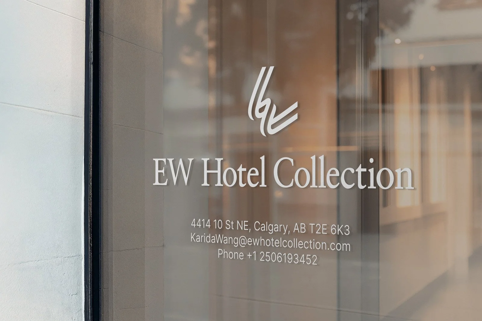
Office Signage
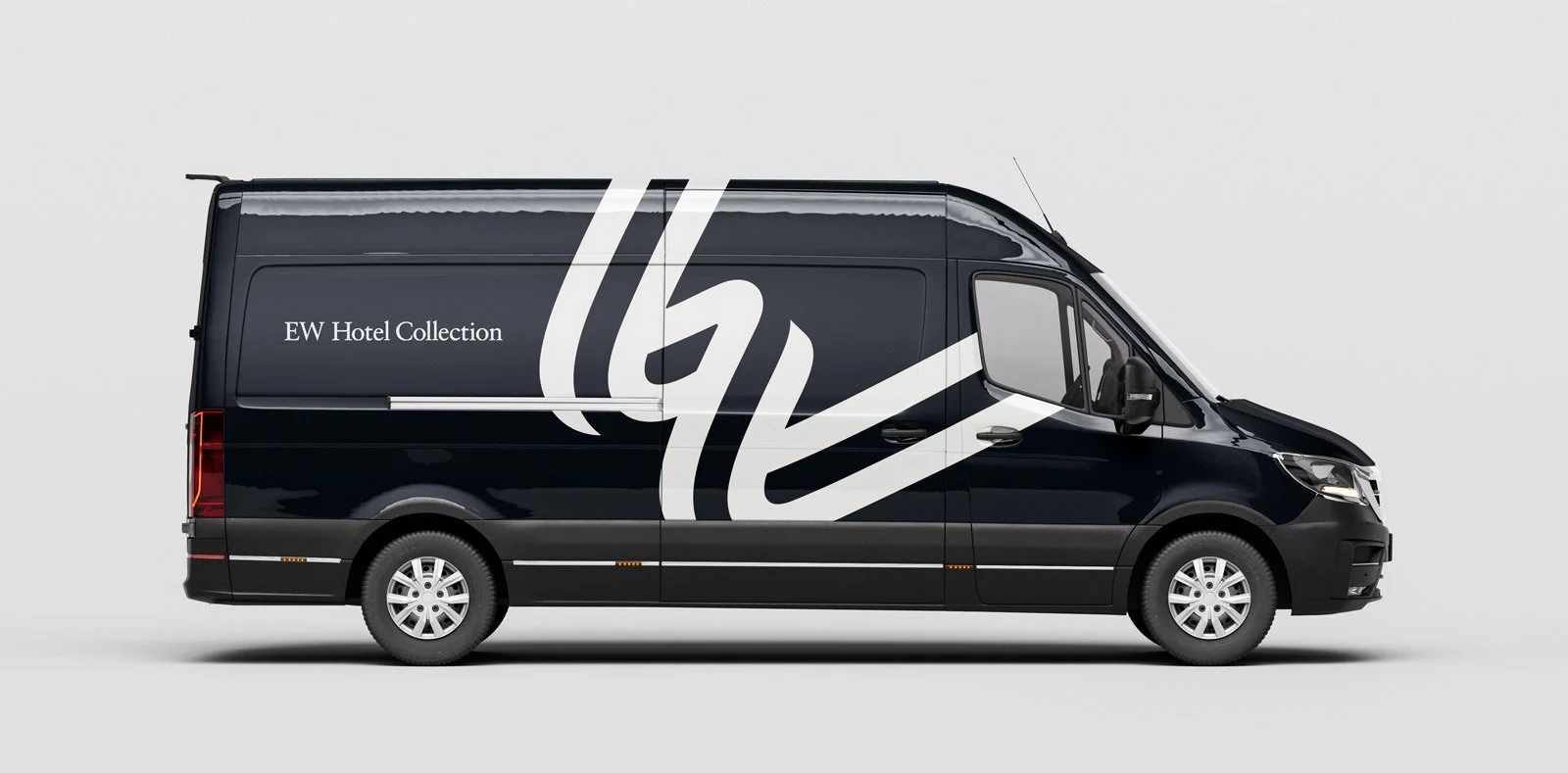
Delivery Vehicle
Advertising Poster
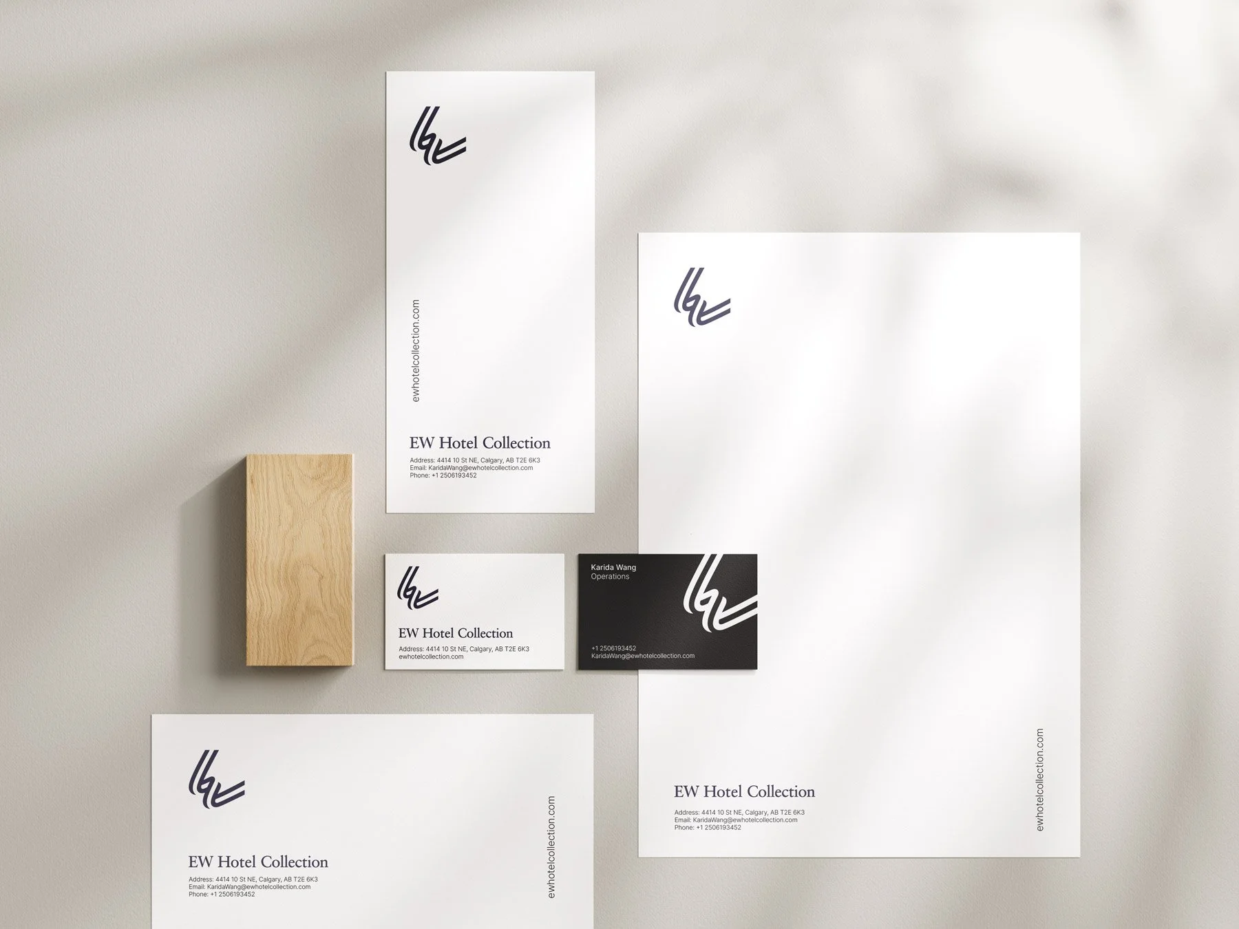
Stationery
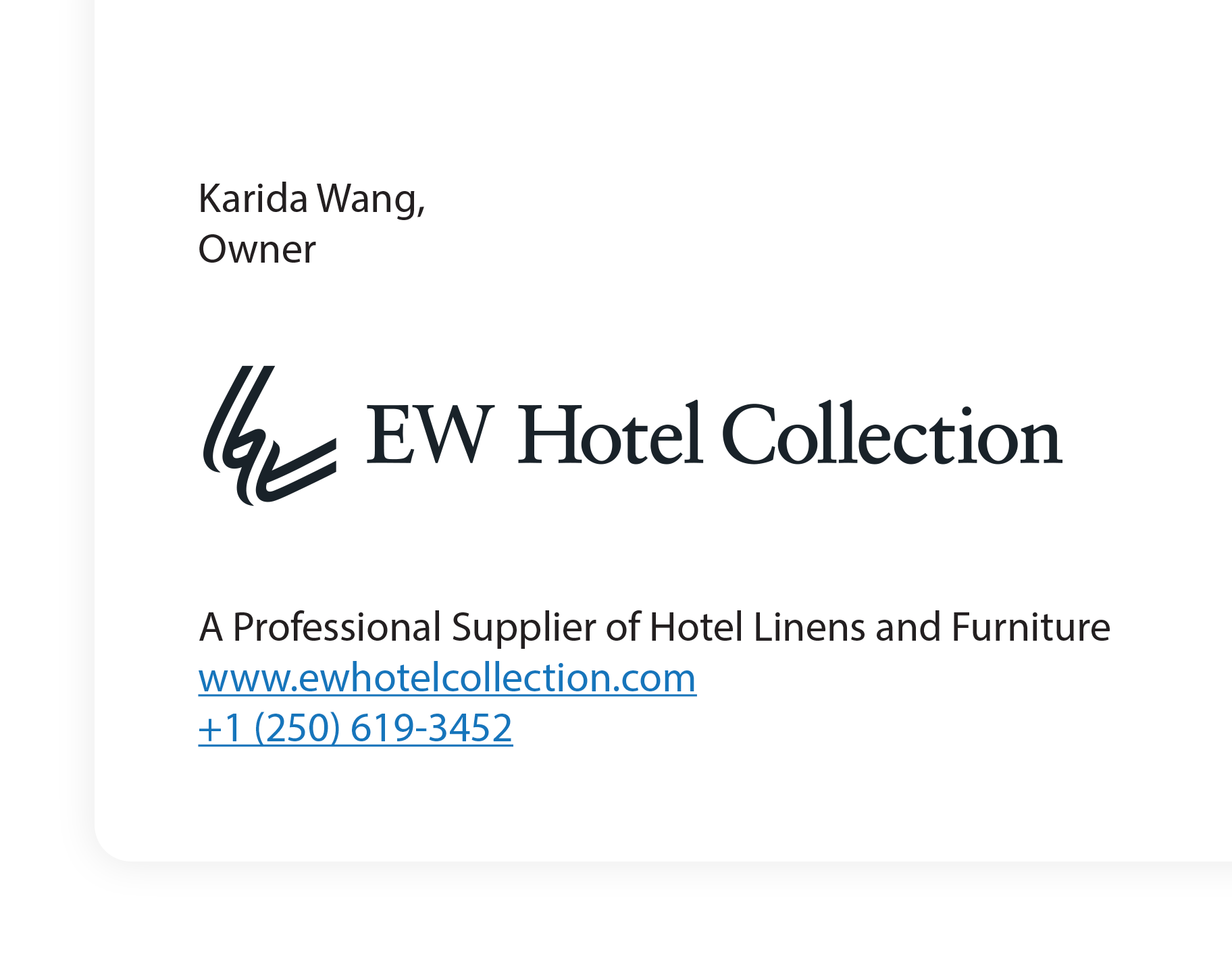
Email Signature
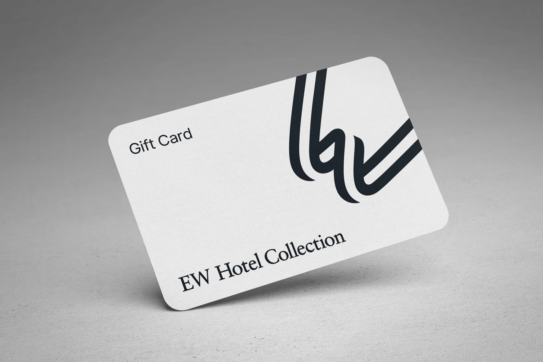
Gift Card
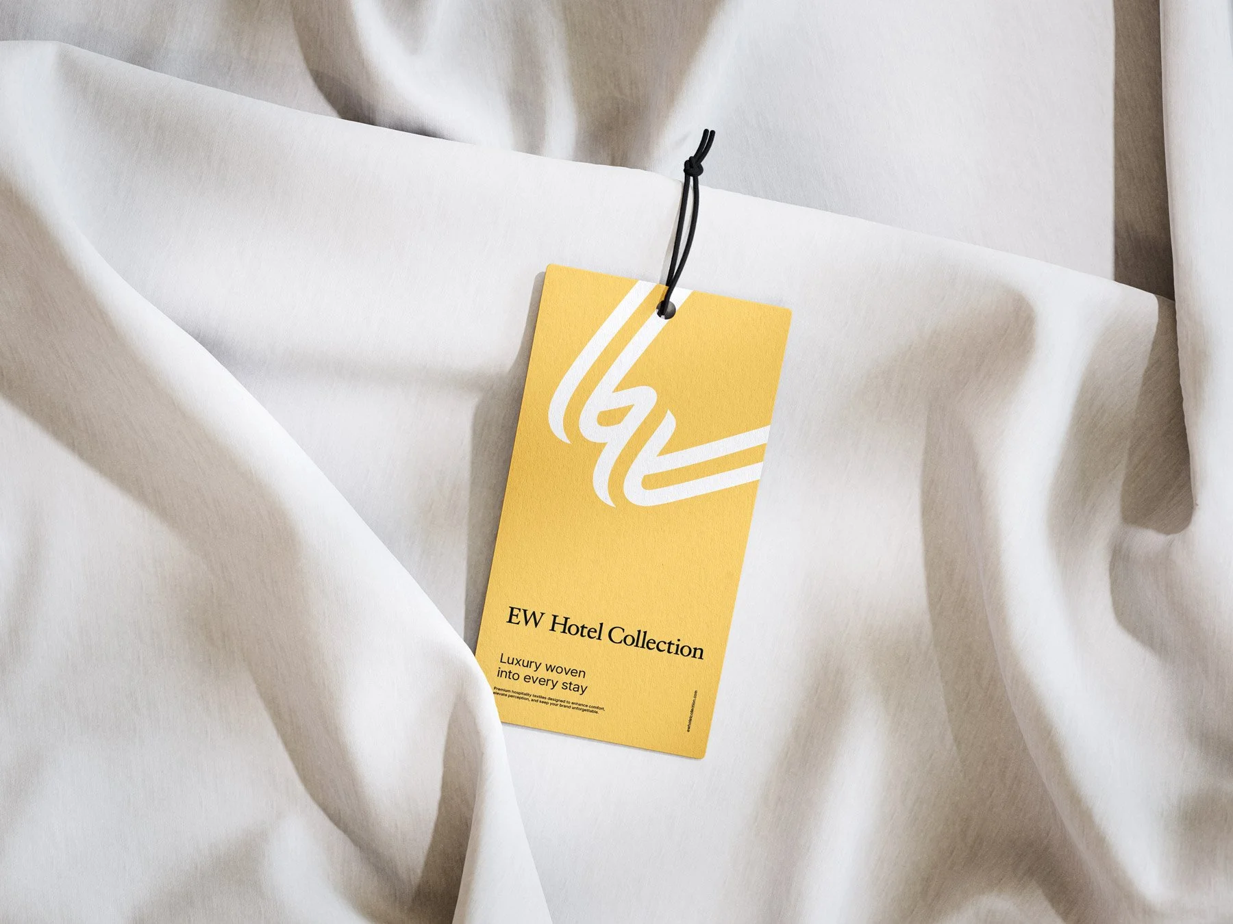
Label Tag

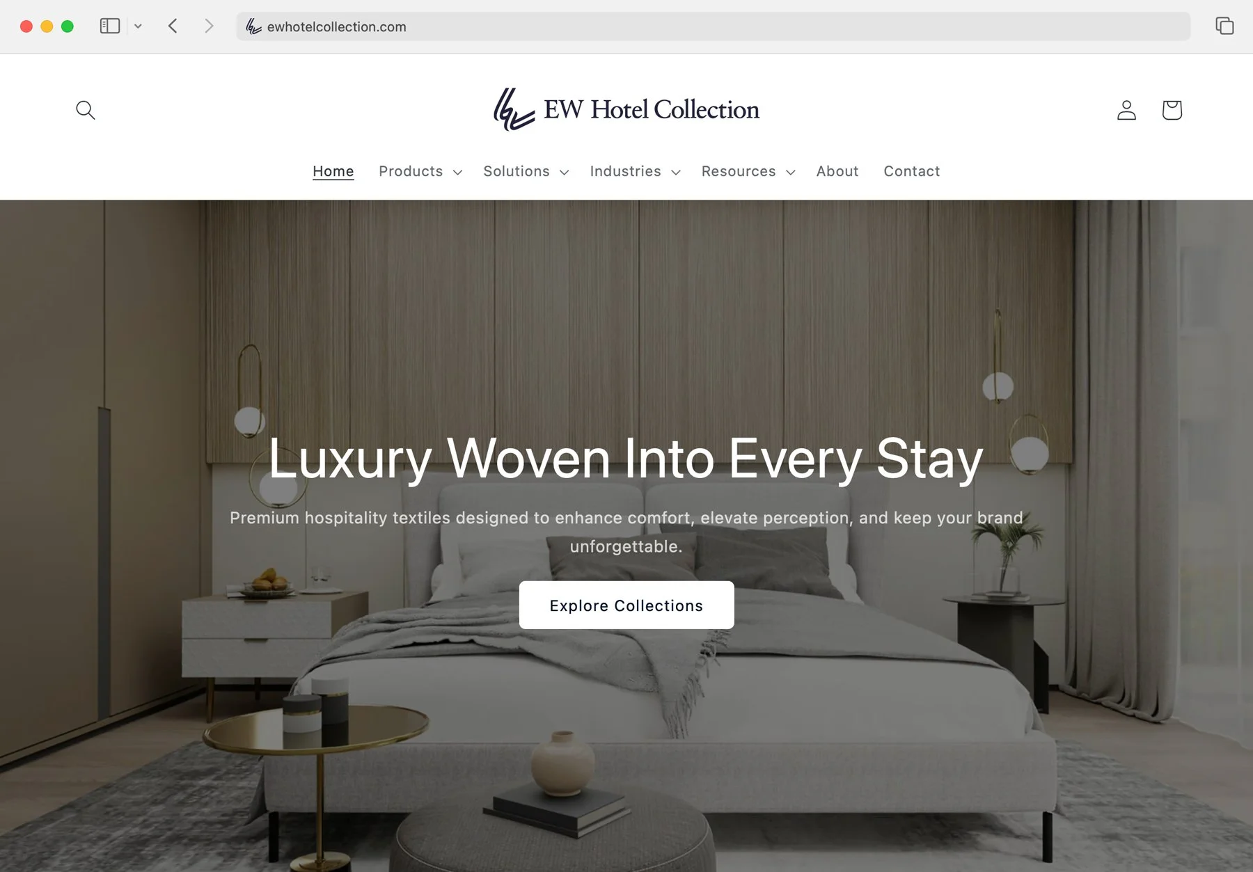
Shopify Website
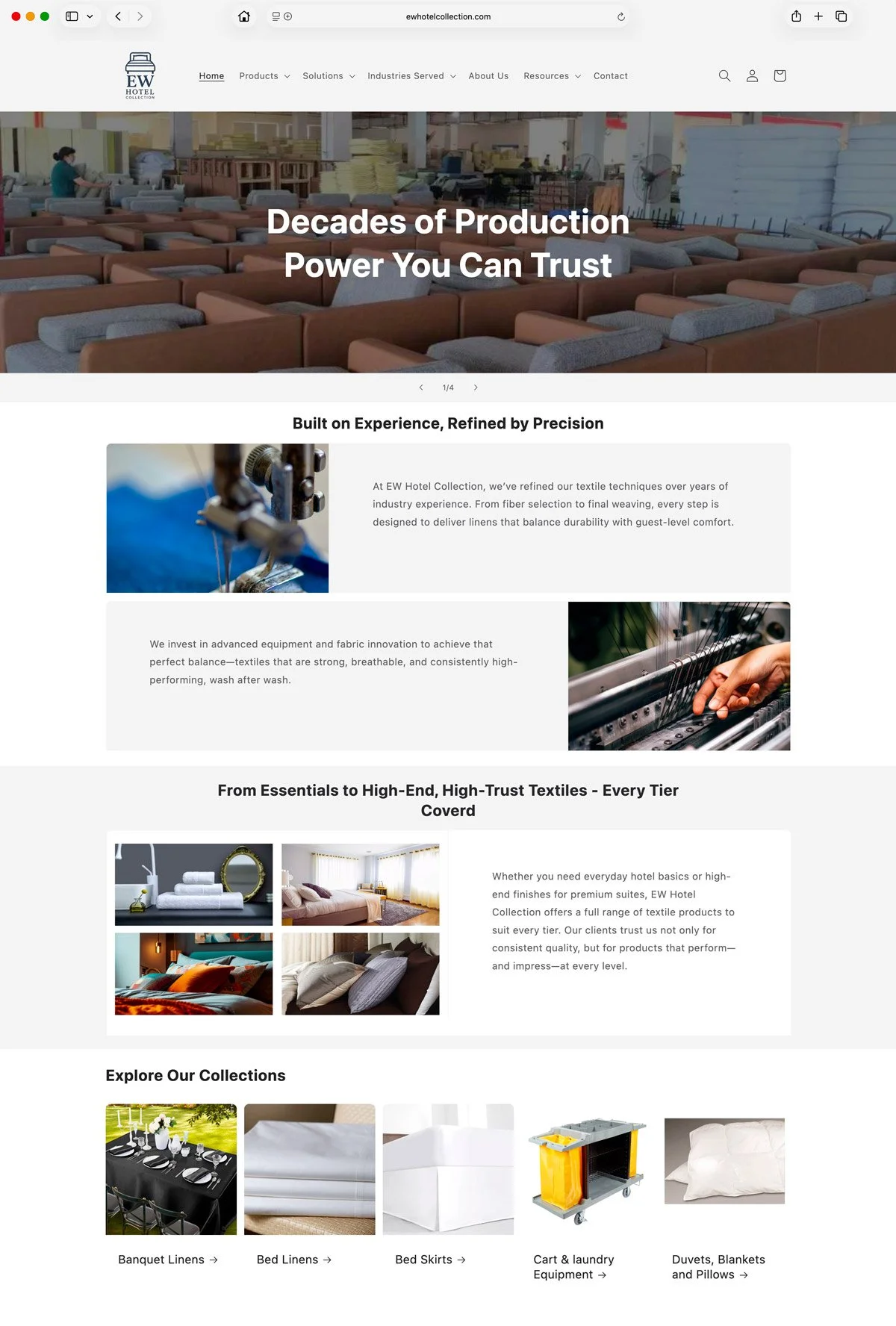
Before
The original homepage lacked clarity and impact, with branding that was too small to register and a layout that prioritised manufacturing-focused messaging. The emphasis was on listing deliverables rather than communicating value, making it difficult for visitors to quickly understand the brand or its offering.
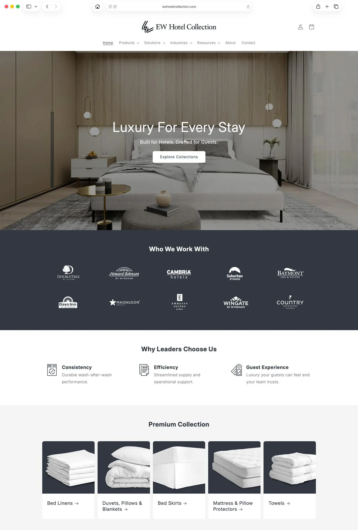
After
The redesigned introduces a stronger, more confident brand presence supported by a clear content hierarchy and consistent use of colour. The messaging shifts toward a more refined, premium feel, focusing on benefits over deliverables making the experience more engaging and easier to navigate.

Textiles Elevating Every Stay
—
Results
The new identity positions EW Hotel Collection with greater clarity and distinction in the premium hospitality market. It strengthens recognition, enhances perceived value, and creates a unified foundation for future growth. With a considered and scalable brand system in place, EW Hotel Collection is equipped to expand confidently while maintaining a consistent and elevated guest experience.